on the eve of the 400th day of Instagram Redesign, I’d like to share some behind-the-scenes details of this work.
To this point, my Redesign has reached over 50,000 views on Behance — an absolute record at the local level.
Before I begin, I’d like to first mention a couple pieces of advice that helped me through this journey.
For me, what makes this project a success is the ability to, in the end, express everything I felt was necessary, as far as removing, modifying or adding features of the app.
And this, despite my input being considerably different, in many aspects,from what was on offer with the app.
This is a beautiful and satisfying lesson I learned, that, even far-stretched ideas and radical changes are potentially successful and likeable.
On this note, I’d say that one must be courageous to share his or her idea; their originality makes the worthy on their own even if they’re not well received.
Because design should be about leaving that beautiful expression, providing that positive experience, as much as about providing solutions to problems ore merely fulfilling some expectations.
Now let’s turn to my Instagram Redesign.
I enjoy using the Instagram app on a daily basis. I’d say it offers a lot of satisfactionin keeping in touch with my network of friends.
Yet, as a tech & design guy, I felt the app could be even better, given a few tweaks and additions.
Thus I embarked on the attempt to make the Instagram app better, starting, naturally, from the standpoint of what works for me and what satisfies my needs and expectations regarding this app.
Leaning on my clear vision on what was to be done with the app, I believed my lack of experience of working on such an app or a similar undertaking wouldn’t constitute any major hindrance.
I began by asking the simple question:
“Why do I use the Instagram app daily?”
And the answer was quick and clear: “Because I want to view my friends’ photos and videos.”
Afterwards, I took to analyzing those features that I thought needed changing or removing, and others I’d wanted to add.
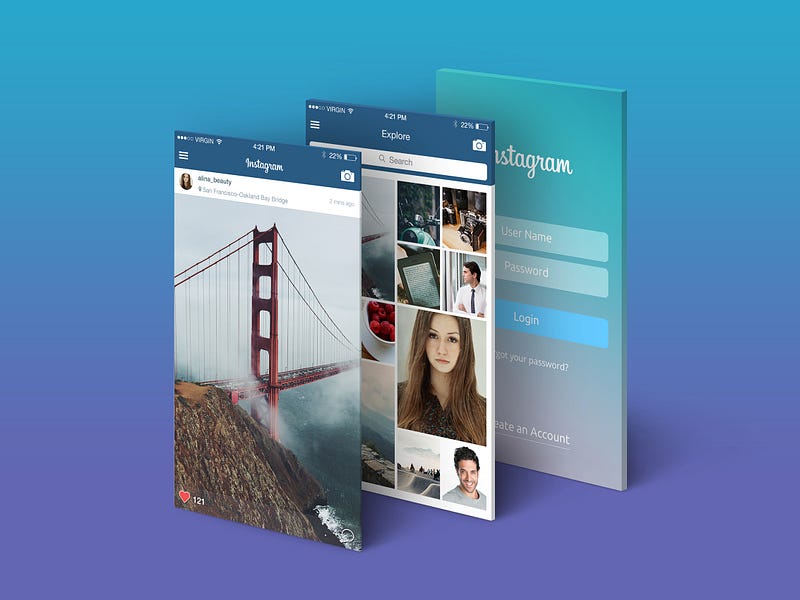
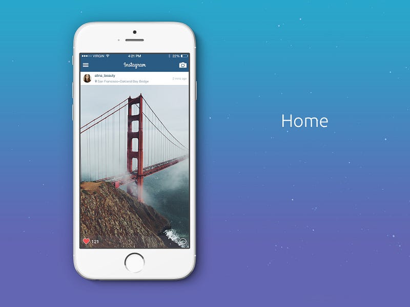
I thought the photos, which came in rectangular frame, could be better viewed in fullscreen size. Besides, the comments could be hidden away, as I felt I was more interested in going through the photos and not necessarily the comments.
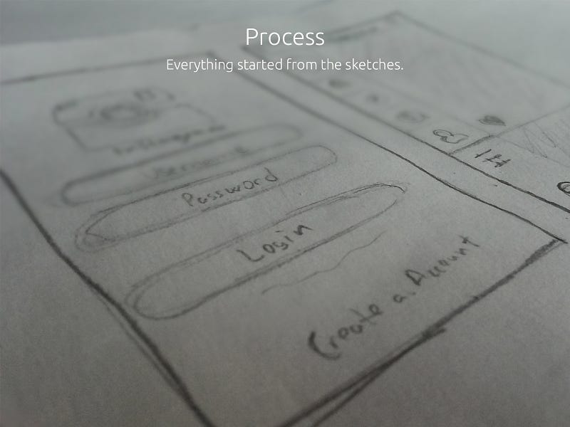
I started sketching the new Instagram, first by eliminating those elements that I though were beyond the main reasons for which I’d opened the app.
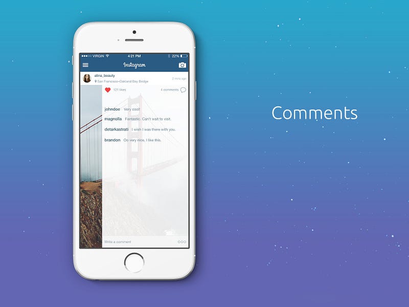
And so I did away with the Comments feature from the Home screen; instead, I added a new feature, which would show the comments, with a left swipe, as an overlay on the photo, and you’d see both the photo and the comments at the same time.
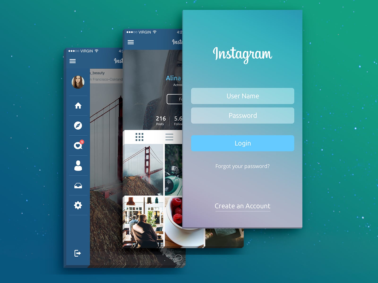
The Menu
Since the Home screen was the one I was using most of the time, I decided to remove the Menu from the bottom left side of the screen and instead bring it on via right swipe. But a problem got on the way, as I was trying to displace the Menu.
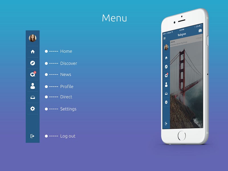
Namely, the main function of the app, the “Upload post”, needed an extra click to be activated. Thus, I placed this function on the top right side of the “Navigation”, completely excluding it from the Menu. Once done with these changes, I started feeling that the app is now really different, and set to also tackle the Profile screen.
The Profile screen
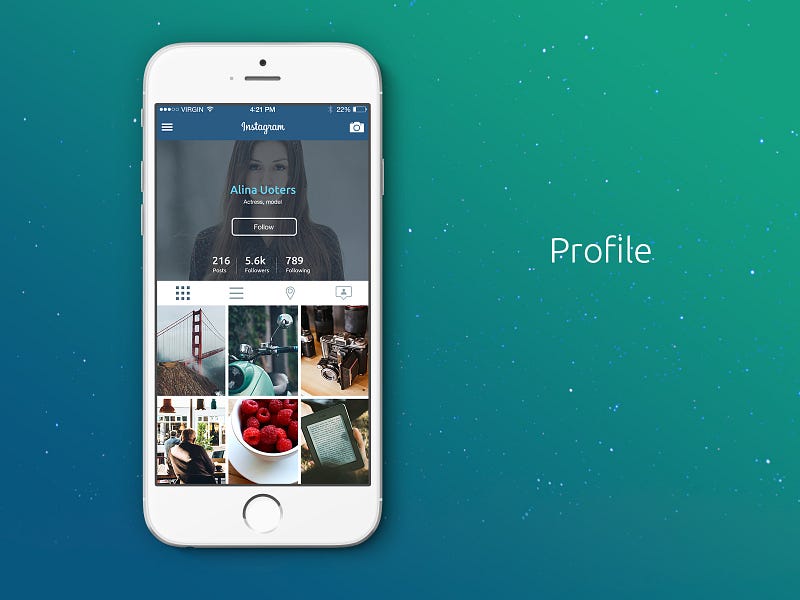
The style/design of the profile screen had been overused, having had been taken up by many other apps, and had thus become boring. I worked on the new screen, which would have the user picture on the background, with the user info on top of the photo and their latest posts.
Discover Screen
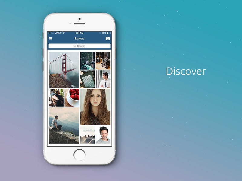
Here I made a tweak, which I believed I’d never seen anywhere else. Instagram had three main pillars, which repeated themselves endlessly. This seemed very boring to me, so I worked on a new screen, which had two pillars where differently sized photos would appear.
This pattern repeats itself throughout, and provides a much more fun experience, compared to the original one.
News Feed
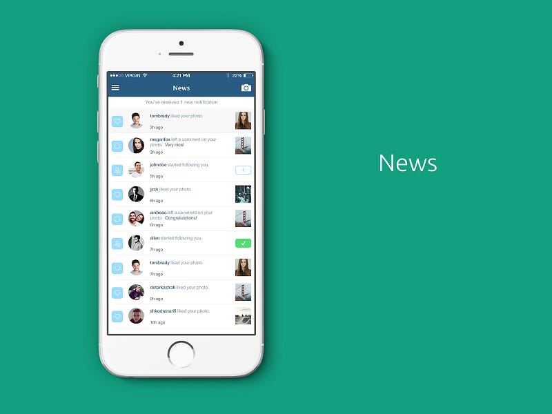
To the News feed feature I added a new element — an icon to the left of each notification, which categorizes them into, for instance, likes, comments or new followers.
To summarize, I‘d say that the most striking feature of my Redesign was the change of the photo format, from a rectangular frame to full-screen size. This seems to have captured the attention of the viewers, and seems to be the biggest factor in making this project a success.
source:


0 comments:
Post a Comment
Thanks for visiting the best tech and science gist blog in Africa
how do you rate our updates? we hope you find the updates and tips useful.
please visit again for more gist on Internet surfing and day-to-day computer tips
Olanrewaju O. Philip
Blog Author.